If you enable mobile template for your blog, here is a good news, you can now customize your mobile site to your own personal taste using CSS definitions. You will able to decide which widget is to be displayed in mobile site and which one shouldn't. You can also configure a widget to appear on both desktop and mobile site.
How To Customize Mobile Template
The default widget that appears on mobile template are as follow:- Header
- Blog
- Page List
- Adsense (If applied)
- Profile
- Attribution
Three properties can be use to control how widget operates, and the properties include:mobile="no", mobile="yes", and mobile="only".
If you want to hide any default widget, simply use the mobile="no" property to hide the widget in mobile website.
Example: The default widget tag/code for attribution widget is:
<b:widget id='Attribution1' locked='true' title='' type='Attribution'/>
Now to hide the attribution widget, simply insert the mobile="no" property as shown below
<b:widget id='Attribution1' locked='true' mobile='no' title='' type='Attribution'/>If you want to show any non-default widget, simply use the mobile="yes"property.
Example: The default widget code for the archive widget is:
<b:widget id='BlogArchive1' title='Blog Archive' type='BlogArchive'>Now use the mobile="yes" property as shown below
<b:widget id='BlogArchive1' title='Blog Archive'mobile='yes'type='BlogArchive'>If you want to show a widget only in mobile site, simply use the mobile="only"property.
Example: Let's try to show the archive widget only in mobile site, using the mobile="only" property as shown below.
<b:widget id='BlogArchive1' title='Blog Archive' mobile='only' type='BlogArchive'>What Next?
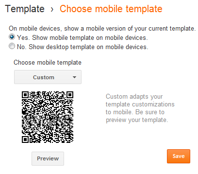
Now go to Template, click on the gear icon below the mobile template and set it as shown in the screenshot below.

It is advisable that you Preview the custom template before you finally click on the
Save button.

.PNG)


.PNG)


0 comments:
Post a Comment